.svg)
.svg)

.svg)
Share this article
.svg)
.svg)
.svg)
Introduction to Webflow - Review of Webflow University's 101 Course
.svg)
.svg)
Webflow is a tool that allows you to easily build and publish websites with a graphical user interface instead of coding. In other words, you build a website by dragging and dropping and modifying settings. It is kind of like WordPress [1]. Additionally, for those using Webflow to create their websites for their businesses, understanding the over 200 ranking factors detailed in our comprehensive guide, Exploring Google's Ranking Factors, can be immensely beneficial in optimizing their site for better search engine visibility.
Should You Use Webflow?
I, the “newish” employee, am learning Webflow to better assist on our blog. I started with Webflow University’s 101 course, which covers basic Webflow with some web design fundamentals[1].
I started this course with prior experience in web development and programming. I was a bit surprised how similar Webflow is to doing CSS by hand. Almost everything in Webflow has a direct corresponding property in CSS and HTML. Exceptions, like Quick Stack, which enable one to easily build layouts, are just a combination of CSS properties packaged together. I think you can learn most of the fundamentals of CSS and HTML using Webflow, so it is useful as a learning tool.
Even though it uses HTML and CSS concepts, Webflow is much easier than writing your CSS and HTML with code.
- Most style options are in front of you, so there is a lot less time spent trying to remember the name of a style property.
- You can drag and drop elements onto the page.
- Quick Stack makes formatting the structure of the page much easier.
- The way Webflow implements breakpoints is intuitive.
- CSS inheritance is made easier to follow with color coding.
(If any of this seems like gibberish I will be going over HTML, CSS, Quick Stack, Breakpoints, and Style Inheritance in this article.)
Webflow also enables users to build sophisticated effects that would be challenging to make with code. Users can build sites with:
- Parallax scrolling (the background is fixed as text scrolls by)
- Video backgrounds
- Animated elements (transitions and rotations in 2D or 3D)
- Lottie and After Effects animations[2],
- Night mode[3]
- Persistent data using a Content Management System (CMS)
- Connections to services like Google Maps[4], Stripe, or Paypal[5]
- Online stores
Our review of Webflow's 101 Course
The Webflow 101 course was a good introduction to the platform. The course demos how to build a single-page website. It isn’t very long (2 hours and 25 minutes) and it is split into small videos. The tone of the course is lighthearted.
They cover:
- The basics of HTML and CSS
- Applying style selectors to apply specific styling to elements on a page
- Style inheritance
- How to apply styles like color, shadow, size, padding, font types, font style, etc..
- How to build a page layout with sections, containers, Quick Stack, and divs
- How to add different elements to a page from the add panel
- Flexbox and Grid layouts
- How to make your page responsive (i.e. usable on differently sized devices) by applying breakpoints
- How to make animations when a page loads or when someone interacts with the page
- Publishing your website (assuming you have purchased a domain)[6]
In the process of explaining these concepts, they build a simple one page website that has:
- A navigation Bar
- A hero image ( A banner at the top of the page)
- A grid of logos (images)
- A grid of cards (divs with text and images)
- A form with a submit button
- A footer[1]
This is an Embellished Study Guide for the 101 Course
For this tutorial, I made a webpage that is modeled off but does not a duplicate the 101 course. In most parts, I follow the same steps they do with additional style choices.
Like the 101 course, I will cover a navigation bar, hero image, grid of images, grid of cards, and a footer. Each section will outline the steps to use and the specific styles applied to get the effect I created. I will also go over the basics of HTML and CSS.
However, I am going to spend more time focused on design than the 101 course does.
Web Design is Hard - How to do Web Design For Beginners
Webflow University's 101 course teaches the technical skills to add elements to a page and apply styles. It does not, however, go into detail on what good design is. It doesn’t answer “what makes a page look good”.
This is a shame, because I find this to be the hardest thing about designing websites. Nothing about writing CSS and HTML with code is complex. In my experience, the real time suck is staring at a page while thinking “That doesn’t look right”. You then move a block of text 30 pixels to the left (or 40, 50, or 60…) and still think “That doesn’t look right”. Repeat this ad nauseum. Place head in the toilet. Flush.
Fortunately, if you lack design chops, design is an art that isn't left entirely to personal taste and guesswork. There are more objective parameters of what looks good. To put it another way, there is no famous Duchamp’s fountain in web design. There are things far more horrifying and creative online, sure, but it isn’t put on a pedestal. There is a “good” and a “bad” that doesn’t just come down to personal opinion, because you are designing a site that the average person can use. For example, 7 pt sized text is clearly bad. Flashing red text on a blue background is also clearly bad. That gives us some guidelines. People like me, who lack all taste, need those or things are going to get out of hand.
The “7 Elements of Design” are useful guidelines:
- Line
- Color
- Texture
- Size
- Shape
- Value - how dark or light something is
- Space - space between elements[7]
Perhaps designers will come for me in the middle of the night, but my suggestion is to limit your focus to color, value, size and space. We’ll add a fourth concept, balance, which is how you make sure visual weight is distributed in a way that looks satisfying. This isn’t advice to make a super beautiful composition. Rather, it's advice to make a design look like it shouldn't be buried. I choose these five because you need to at least get these right.
This is your revised list to focus on:
- Color
- Value
- Size
- Space
- Balance
I’m going to mostly ignore texture, shape, and line. I think you can make a decent page without ever thinking about texture. As for shape, the vast majority of things on the page are going to be rectangles. Whatever. Line matters for border settings, but those embellishments can be added when a page is mostly done. Line is a major factor in font types, but a deep dive into typography doesn't need to be in an entry level tutorial. I'm not a sadist.
How to Pick Your Website's Font
Speaking of typography, I’m going to limit our font choices. Google Fonts offers over 1,400 font choices[8]. It's too much.
Webflow’s blog has a few font recommendations. Try to start with those if you don't see a font you are drawn to. You can always change them later.
Choose between[9]:
I like Roboto and Inter. For my demo site, I ended up using Oswald. It’s a nice basic font with a boxy look.
Choosing Color for Websites
Here are some basic guidelines to help you pick a color scheme for your website.
Build your page in grayscale first.
Unless you are set on a color scheme (such as your brand colors), life is easier if you don’t bother with color till most of the page is made. You can easily just build in different shades of grey and change it all at the end with Webflow.
The more colors you pick the harder your life will be.
It's a good idea to use three (or fewer) colors in your design (in addition to black and white).Your primary color should be used 60% of the time. The secondary color is used 30% of the time and the accent color should be used 10% of the time[10]. The primary and secondary color is meant to “set the mood” of a design. The accent color brings the user’s attention to specific elements[10]. For example, you might make most of your site be navy blue and a dark shade of teal and then use bits of bright yellow around your buttons and call-to-action items.
Don't forget neutrals.
Use neutrals (black, white, and gray and cream shades) with your other colors. Neutrals go with everything. It also helps if you don’t know how to dress yourself.
Use different shades of the same color.
Changing the darkness or lightness of a color can improve readability. You can rely on this tip entirely and make a monochrome website. It is also an easy way to expand your color palette if you feel limited by the three color rule.
Take Advantage of The Colors In Your Images
If you already have images you can use an online image color picker or just about any Photoshop-like graphics tool to pick out colors. I like using this technique because it requires zero inspiration and it helps the site "mesh" with its images better.
Colors have symbolism and psychological effects. Take advantage.
You are probably familiar with these associations already.
Red
Red is associated with excitement. It can increase respiration rate and raise blood pressure[11].
Associations
- Love
- Passion
- Anger
- Strength
- Courage
- Sexuality
- Appetites
- Power
- Danger
It is a good choice for a restaurant (lots of diners use red). It is a bad choice for a spa. If your site needs to have a warning or error messages it’s a good idea to put them in red to get people’s attention (outside of your normal color scheme).
Orange
Orange has association with enthusiasm. It’s the compromise between yellow’s cheerfulness and the stimulating effects of red[11].
Associations
- Optimism
- Self-confidence
- Encouragement
- Extroversion
- Happiness
- Enthusiasm
- Rejuvenation
- Courage
- Vitality
- Appetite[11]
Yellow
Yellow is another stimulating color associated with happiness. Like red and orange, it has the potential to cause irritation or nervousness[11]. This makes intuitive sense when you think about the roles red, orange and yellow play in the animal kingdom. A wise animal will think twice about eating another that is bright red, orange or yellow because it might be poisonous. This doesn’t mean you shouldn’t use warm bright colors, but they aren’t best suited for websites that are meant to have a relaxing effect.
Associations
- Intellect
- Creativity
- Uplifting
- Fun[11]
Green
Consider using green if you run a business that is associated with nature, (landscaping), relaxation (spas), or money (banking, financial advice)[11].
Associations
- Nature
- Growth
- Healing
- Freshness (light green)
- Money or wealth (dark green)[11]
Blue
At least according to polls, blue is probably the most popular favorite color in the world (and if you don’t want blue another good bet would be green or teal)[12]. It is an extremely safe bet for your primary or secondary color.
Associations
- Trust
- Peace
- Maturity
- Integrity
- Conservatism
- Calm[11]
Purple
Purple is a good choice for businesses that have associations with luxury.
Associations
- Wealth
- Royalty
- Imagination
- Creativity
- High-Quality Items[11]
Try Color Generators
Coolors is a free color generator[13]. It starts off with five colors. To delete two of them, hover over the color and click on the "X" to delete. The space bar can be used to generate a new set of colors. If you see a color you like, click the lock icon and that color will remain unchanged as you get new recommendations (with the space bar)
Once you find three colors you like, you can make your life easy by clicking on the triangle circle square icon to “visualize colors”.
Here is a set of colors I liked:
And here is how Coolors predicts it might look on a website.
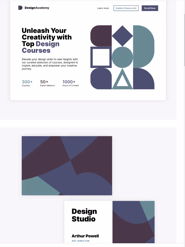
I like where it's going, but it looks a bit dark (and not saturated enough), which brings us to our next major element of design…
Value
Value refers to the lightness or darkness of elements on the page. The obvious area where value is going to matter is contrast for easy readability and emphasis.
Value is Useful for Hierarchy
Value can also be used to create hierarchy on a page. For example, the different headings (H1…H6) can be organized by different values of the same color in addition to size and font weight. You can also apply this concept to saturation, which refers to how strong the color is present. I like to vary both of these.
Here is an example of headings organized by value and saturation.

Value is Useful for Accessibility
Another place where value matters is making sure there is enough contrast between text and the background. You can use a tool like WebAim: Constrast Checker to make sure your site passes accessibility requirements
Just plug in the hex code (e.g.: “#0000FF”) for your background color and your text color. I recommend having a contrast ratio of 4.5:1 or higher for your paragraph text and figure captions and 3:1 or higher for your headings and larger text. That covers the requirements for WCAG level AA[14].
Value Can Set the Mood
Coming back to our palette generated by Coolors. Our previous colors were a bit dim and gloomy for my taste.
They look dull so I increased the brightness (a value change) and the saturation.
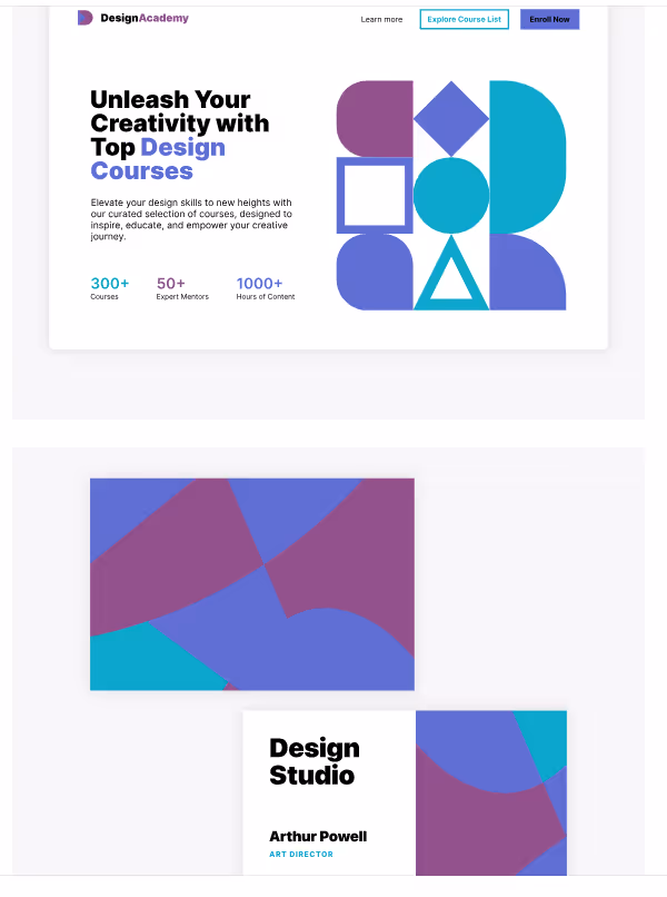
I think that’s a lot better.
How to Create a Balanced Page
Balance in design refers to balancing visual weight of elements on a page. Visual weight refers to where your eye is drawn[15]. It is one of those odd design principles that sounds hand-wavy, but it is actually extremely important. The human mind likes balance. If things are not balanced, things won’t look “right”. To learn how to create balance, we should cover how to create visual weight and the types of balance you can use.
You can easily change the amount of visual weight of an element by changing its size, color saturation, and position and by using white space. That’s not an exhaustive list of how to change weight, but I think it is the easiest to follow.
To increase visual weight in an object
- Make it bigger[15]
- Picture the primary colors at full brightness full saturation (colors straight out of the crayon box). The colors from heaviest to lightest are: red (stop signs are red for a reason), blue, green, orange, and yellow[16].
- Increase the saturation[15]. Pastels have low visual weight.
- Put it up higher. Items at the top of the page are going to attract the eye more than the bottom[15].
- Put empty space around the object. White space has no weight, so when an object is surrounded by white space it gets more weight and emphasis[15]. One child in a long empty hallway is significantly more striking (and creepier) than five kids. (Two is upsetting if they are twins).
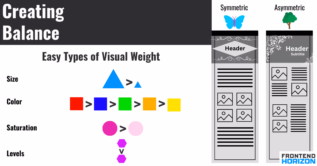
Your easy options for balance are symmetric and asymmetric[17].
Symmetric balance has the visual balance of a butterfly. Divide the page in half: the two halves could lay on each other in a mirror image. This is the easiest form of balance to understand[17]. You’ll probably use this all the time.
Asymmetric balance is when you have composition that lacks symmetry, but there is still balance. If you divide the page in half the elements on each side are different[18]. You’ll use this often as well.
How to Size Elements in Your Website
The size of elements matters both for visual hierarchy, balance, and readability. We have already talked about balance, so we will focus on hierarchy and readability now.
For hierarchy, the more important the heading is the more bold and big it should be compared to your other elements. Bigger elements will attract more attention than small ones, so your call to action items should also be relatively large.
For readability, your main body (paragraph) text size should depend on the device size someone is visiting your site on. You determine this for the user using breakpoints in Webflow (which I’ll go over later). Pick 12 to 16 pt for mobile phones, 15 to 19 pt for tablets, and 16 to 20 pt for desktop and laptop[19]. The fonts for your headings will be larger than your body text.
As an option, you can use the golden ratio to decide on the sizes of your bigger text and line height[20]. Take your smallest font size, multiply by 1.618 and round up[20]. For example, if you have 14 pt font for your body text, a larger golden ratio text would have 23 pt font[20].
White Space
White space is important for both a nice design and mobile usability because there needs to be space between clickable items for people who are using a touchpad.
You can add visual space with margins (space outside an element’s border), padding (space inside an element’s border, and line height. When you use layouts like Flexbox, Grid, and Quick Stack using grid gap settings can also help make elements look less crowded.
Placing your content inside of containers is a good way to increase white space on the sides of the page when using Webflow.
Alright, now onto Webflow...
Getting Started with Webflow
The video series is organized into a short “Getting Started” and a “Site Build “ section.
Getting Started Videos
The Getting Started video set defines HTML, CSS, and Webflow. It is a useful series if you have never been introduced to web design. If you have, you can skip it. I’ll explain the basics here.
Basic websites are made of four components wrapped in folders:
- HTML
- CSS
- Files and Images
- Javascript (if your site is interactive or uses data)
HTML
HTML is a markup language that defines the skeleton of a webpage and its elements[6]. Elements are simply content on the page or the building blocks of the website. For example, paragraphs, buttons, links, and headings are all elements. In Webflow, you’ll be dragging and dropping elements to create a website.
If you had to write HTML by hand it would look like this:
<tag>something</tag>
The “tag” is the type of element. The “something” is the thing going inside of the element. For example, a large heading looks like:
<h1>First Heading</h1>
In this example, “h1” signifies heading 1 (which has the highest hierarchy) and “First Heading” is the text that will appear on the web page.
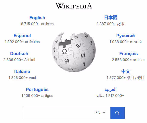
You can mess with HTML on any website by right-clicking a webpage and clicking “Inspect”[6]. Below is the HTML for Wikipedia’s landing page.
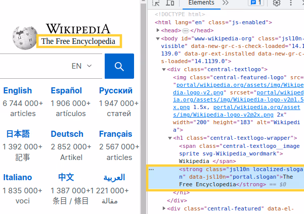
It's possible to change the page by changing, deleting, or adding new elements.
I clicked on the element that makes the subheading that says “The Free Encyclopedia” and deleted it. You can see that it deletes it on the page, at least temporarily. Refreshing restores the subheading[6]. Wikipedia is unharmed.
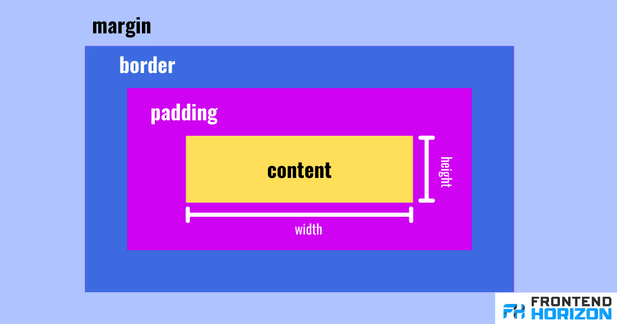
The Box Model
One important thing to remember about HTML (and Webflow) is the elements on a page are organized in boxes. These boxes are organized in the same way as an English text document. When you read this text, the text flows from left to right. When the text reaches the far right of a page it wraps around to a lower level on the left side of the page. The box model works the same way[21].
You can alter the box that encapsulates elements in many ways. You can change the:
- margin - space around the box that is outside of the content box
- padding - space around the box that is inside the box
- width
- height
- border[21].
The image below is a guideline of what you are changing when you change these elements. You’ll use the box model constantly in Webflow.
CSS
You can build an entire website with all the functional parts with just HTML. It won’t look good though. You need CSS to style the page.
CSS (cascading style sheets) defines how HTML elements get styled and the layout[22]. Things like color, spacing (margins, padding), animations, font, layouts, and border are all controlled by CSS properties[22]. There are hundreds of CSS properties[23].
When writing CSS, HTML elements are selected either via classes (a special label to apply styling to specific elements) or the element’s name (to apply this style to all elements). Then properties are listed[22].
Here is the format for CSS:
selector{
property-name: option;
}
This would change all H2 headings so that the font size is 30px and the color is a dark teal:
h2 {
font-size: 30px;
color: #024647;
}
Below is a class to apply a different color to H2 elements that have the class “special_h2”. It overrides the color for H2 from teal to bright pink. Note that there is nothing special about the name "special_h2". I just chose that name.
special_h2 {
color: #fc05e4;
}
In Webflow, you will select elements on a page and then modify CSS properties using a menu. Webflow will generate this CSS code for you.
Javascript
I’ll keep the discussion of Javascript to a minimum because it is more advanced, but Javascript is for dynamic content. An example where Javascript would be used is to display today’s date on a website. Calculations and heavy-duty operations that happen on a website will often be in JavaScript code. Communication with a database will most likely happen with Javascript (or a third programming language).
You don’t have to worry about it.
Site Build Series (+ Additional Layout Learning)
The site build series of the course teaches you how to build a basic one-page website. The page contains a navigation bar, a hero, some items in grids, a form, and a footer.
- Site build: Navigation
- Site build: Logos
- Site build: Cards
- Site build: Form
- Site build: Footer
- Site build: Responsiveness
- Site build: Interactions
- Site build: Design review and accessibility
- Site build: Publishing the site
- Final thoughts & certification
- Quick Stack
- V Flex and H Flex
I recommend watching this course even if you skipped the “Getting Started” series. They built a different website than the one I show below, but I follow the same general steps, which we will cover. The videos are short and video format helps you find things in the menu. I don’t go over publishing the site because we plan to write about the steps to first buy your own domain, so I recommend at least watching “Site build: Publishing the Site” if you want to see what the publishing process is like.
Getting Acquainted With Where Stuff Is
The video series does not go over where everything is in detail, but I think this is one of the main hurdles to using Webflow.
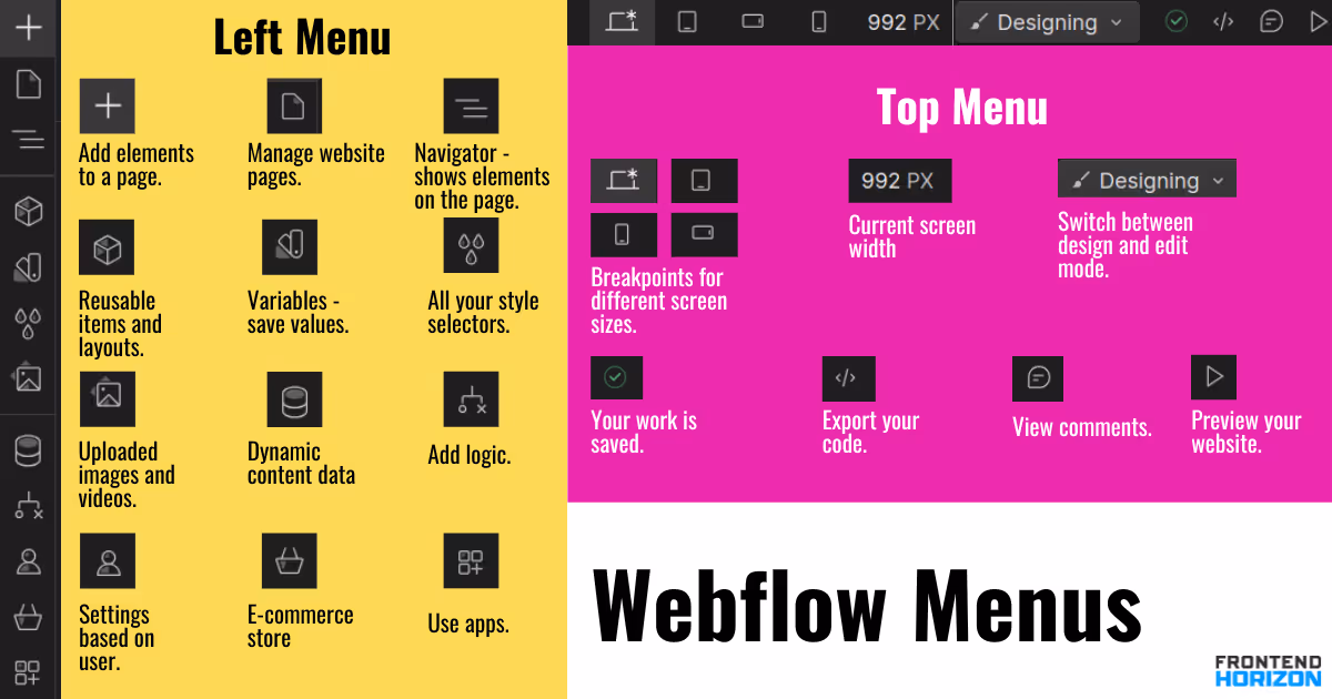
According to me, Webflow has three menus: left, top, and right.
Left Menu
- Main Menu - settings for the entire website
- Add (+ symbol) - This is where elements are to add to the page. You can also type "ctrl/command+ E" to search for elements as well.
- Pages (page symbol) - for managing the pages of your website
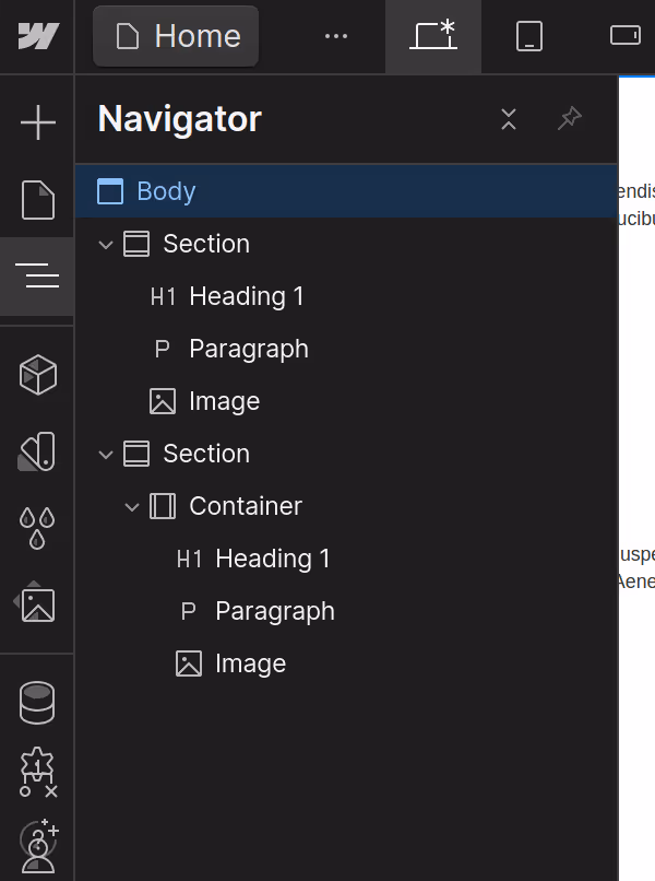
- Navigator (3 lines symbol) - a nested list of everything on your page. You can minimize and expand the section in the navigator. You can also see what is a nested child of other elements. You can also drag and move elements in the navigator. I noticed it is much easier to nest elements into each other this way than dragging objects in the layout. You will use navigator all the time.
- Components (cube) - a menu for creating reusable items and layouts for your website.
- Variables (fan bookmark symbol) - a variable is a representation of some value that you can use repeatedly. If you want to consistently use a certain color you might save it as a variable so you don’t have to write down the hex code over and over again.
- Style selectors (rain drops) - These are all your style selectors. If you need to delete unused styles, you would do it there.
- Assets (image icon) - Here are any photos you have uploaded to use.
- CMS collections (a database/cylinder icon) - is where content to create dynamic content is stored. Dynamic content is content that changes based on context. For example, when you log into a site and it says “Welcome {Your Name}” your name is the dynamic content. CMS collections basically functions as a database.
- Logic (pathway icon) - this is for when you want to add conditional behavior to your site. You would create rules like "If user clicks on button and their email address is valid, then send email to that address. If not, display error message."
- Users (user Icon) - for making your website have a specific experience depending on the user who is interacting with it (like someone who has logged in)
- Store (shopping basket) - for making an e-commerce store
- Apps (three squares and a + sign) - for using Apps with your Webflow website. For example, payment processors.
- Settings (gear icon)
- Help (? icon) - has all your keyboard shortcuts
- Audits (yellow triangle) - This has tips to make your website better.
- Search (magnifying glass) - an easy way to find things in Webflow. To access this quickly ,just type CTRL (or command) + E.
- Video Tutorials - A quick way to access video tutorials
Top Menu
Top menu contains breakpoints. These make it possible for your website to be usable regardless of whether it’s on desktop or mobile. A breakpoint basically makes a setting that says “If my screen is smaller than {some size}, apply these styles”.
- Laptop, tablet, horizontal mobile phone, and vertical mobile phone icon - breakpoints for what someone’s screen will look like when they use your website depending on size
- Canvas Settings - How wide the page is and how zoomed in you are.
- Designing/Editing - Designing is for when you are building a layout. Editing is for when you just want to change the text somewhere without moving or messing with the layout. It's a good setting to use if you have the habit of messing up your own layouts (like me).
- Saved icon (green check mark) - shows that your website is being saved as you work. This should be done automatically, but it's a good idea to keep an eye on it.
- Export code (</>) - This lets you export the CSS, HTML, or Javascript rendered from the Webflow page.
- View comments (comment icon) - useful for communicating if you are working in a group or want to leave notes for yourself.
- Expand screen/hide menus (triangle) - makes your menus disappear and reappear.
- Share - share your site with other people to work collaboratively
- Publish - publish your website
Right Menu
The content on the right menu changes, but I want to go over what it will show when you click on an element on the page. For example, if you click on a heading element, you should see three tabs: style, settings, and interaction.
Style is where you apply the CSS. This includes style sectors (like select all H3 tags), layout, size of elements, spacing and margin, position of elements, typography, background effects, and special effects. You will use this panel all the time.
Settings are for situations like determining where links should lead when someone clicks on them.
Interactions is for setting styling behavior based on user interactions and page loading. For example, if you want your main heading to progressively fade in when the page loads, you would go to settings to make that happen. You have the option to change styles when the page loads, an element is clicked on, or when the user hovers their mouse over an element.
Quick Tricks
- "Command + Z" or "Ctrl + Z" is “undo”[24].
- "Command + E" or "Ctrl + E" brings up search to find elements[25].
Building a Layout
The course starts with building specific items on the page like a navigation bar and a form, but let’s start with what you'll do almost every time you build a page.
Every page in Webflow is organized in vertically stacked sections. You will begin building your page by dragging in a section from the “add panel (+)”. You’ll then drag in other elements like divs, headings, paragraphs, and images into that section. The height of a section depends on what is inside it; it expands as you add content[26]. You can also set the height manually[26].
In this tutorial and the 101 course, they build a navigation bar, a hero section, two grids, and a footer. Each of these goes in its own section. If you begin by adding a paragraph and heading to your section, you should notice that the text of the paragraph stretches across the entire page. That looks okay for a navigation bar and hero image, but it isn't what we want much of the time. For most of a site, it looks much better if there is some whitespace on the sides of the page. To add space on the sides of the page, add a container and place it within your section. Put your HTML elements within that container.
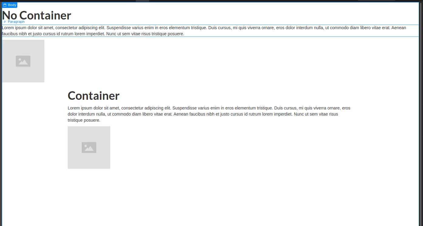
If you are having trouble dragging items into each other to nest them go to the navigator menu in the left menu. You can see what is nested via indentation. You can also minimize parts of the navigator menu to keep organized without changing the page[26].
Style Selectors
In the prior section, HTML is applied by dragging elements and nesting them on the page. Now, we move on to CSS by applying styles.
The basic way to apply CSS styles is to click on an element (such as a button) and then to change style settings in the right style menu. This will apply styles for the single element that you have clicked on. However, if you want to repeat the style on many elements without modifying CSS each time, you'll have to use style selectors.
Let’s say have a page with three links. You want each link to be bold, turquoise, and 30 px. You can either apply that style to every link by resetting the font and colors each time you click on a link or you can create a style selector once and apply that style selector to elements.
You have two main options for style selectors: class selectors and HTML tag selectors.
If you want every link on your page to be turquoise, 30 px, and bold use an HTML tag selector (such as “All Links” and then apply those styles. If you want a few of those links to be pink, you would apply a class selector by making up a name (like “pink-link”) and then setting the color. The class selector “pink-link” is going to override the HTML tag selector “All Links” by changing the links from turquoise to pink.
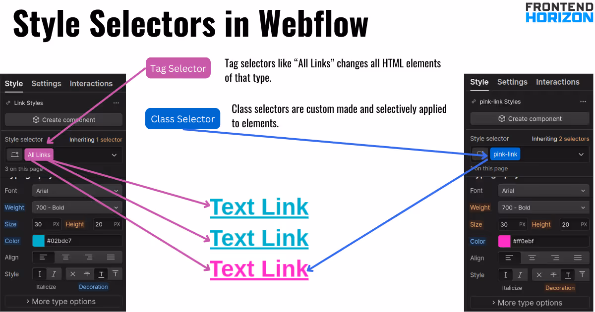
HTML tag selectors are in pink and the names are predefined by Webflow. Class selectors are in blue and you make up the name. You can apply multiple class selectors to the same element. When you do that, it’s called a combo class.
Styles are inherited in both CSS and Webflow. Inheritance is a major concept in CSS that you'll have to master in Webflow.
To see inheritance, let’s go over an example of styling a page. We’ll fulfill these requirements one by one. Your site requirements are:
- All text should default to purple
- All H2 headings should be green
- One H2 heading and paragraph should be underlined
- One H2 heading should be pink
“All text should default to purple” - Use “Body”
In Webflow, you can style for “body”. “Body” refers to the entire page. Webflow conveniently has a tag style selector that says “Body (All Pages)”. You would use this style selector and then change the text color to purple. All other tags are going to inherit from this style and default to purple. You would use this tag to set the font of your page.
“All H2 headings should be green” = Use “All { HTML tag}”
Click on an H2 headings and select “All H2 headings” and then change the text to green. Webflow allows you to select *all* of different types of HTML tags. So, you can select “all paragraphs”, “all H2 headings” etc. “All H2 headings” should turn from purple to green because “All H2 headings” is overwriting “body”. The headings are still inheriting from “body” though. If you were to remove “All H2 headings” or revert the color setting, the headings would all turn back to purple (the setting for "body").
One H2 heading and paragraph should be underlined = Use a Class Selector
Click on an H2 heading and make up a name for a style selector such as “underlined”. Now select the underline style. Then click on a paragraph and search for your “underlined” tag again to apply it to the paragraph.
When you make up a style selector it makes a class. You can reapply this class to other elements on that page. This “underlined” class is styling on top of “all H2 headings”. Your underlined H2 now has three classes applied to it: “All H2 Headings”, “underlined”, and “body”.
You want one H2 heading to be pink = Just click on the element
Style selectors are for styles you want to apply more than once. If you don’t expect to reuse a style just click on the element and then change the styling. Click on H2 and change the color to pink. H2 still inherits from “All H2 Headings”, “underlined”, and “body”, but this pink change overwrites the prior color settings.
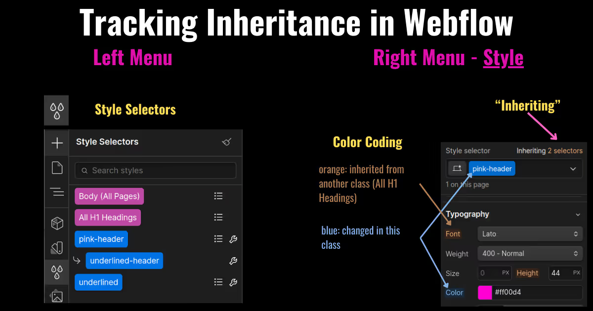
How to Keep Track of Inheritance in Webflow
One of the hard things about CSS and Webflow is keeping track of what is being inherited and where the inheritance is coming from. If you ever are trying to change a style and it seems like it doesn’t apply, check whether you are inheriting from a class or HTML tag selector.
To track your inheritance of styles you have three tools in your style menu (right) and style selector menu (left).
First, there is your properties (e.g “color”, “padding”, “font”, and "padding” are color-coded:
- White text - Property is not modified for the current style selector or any of the styles it inherits from
- Orange text - Property is modified in a style selector the current style selectors inherits from
- Blue text - Property is changed for the current style selector
Second, next to "Style selector" in the right menu there is a text that says "Inheriting {# of selectors}”. This lists of all style selectors your currently selected class inherits from.
Third, there is a style selector on the left-hand menu that looks like water drops that shows all the styles you have regardless of whether you are using them or not.
Now, we’ll go over how to build a basic site. For the instructions, I have tried to separate my more ”stylistic” choices from the basic steps of building each component. The color or specific padding I choose doesn’t matter. I include it for extra information in the accompanying images.
Here is the site built in this tutorial.
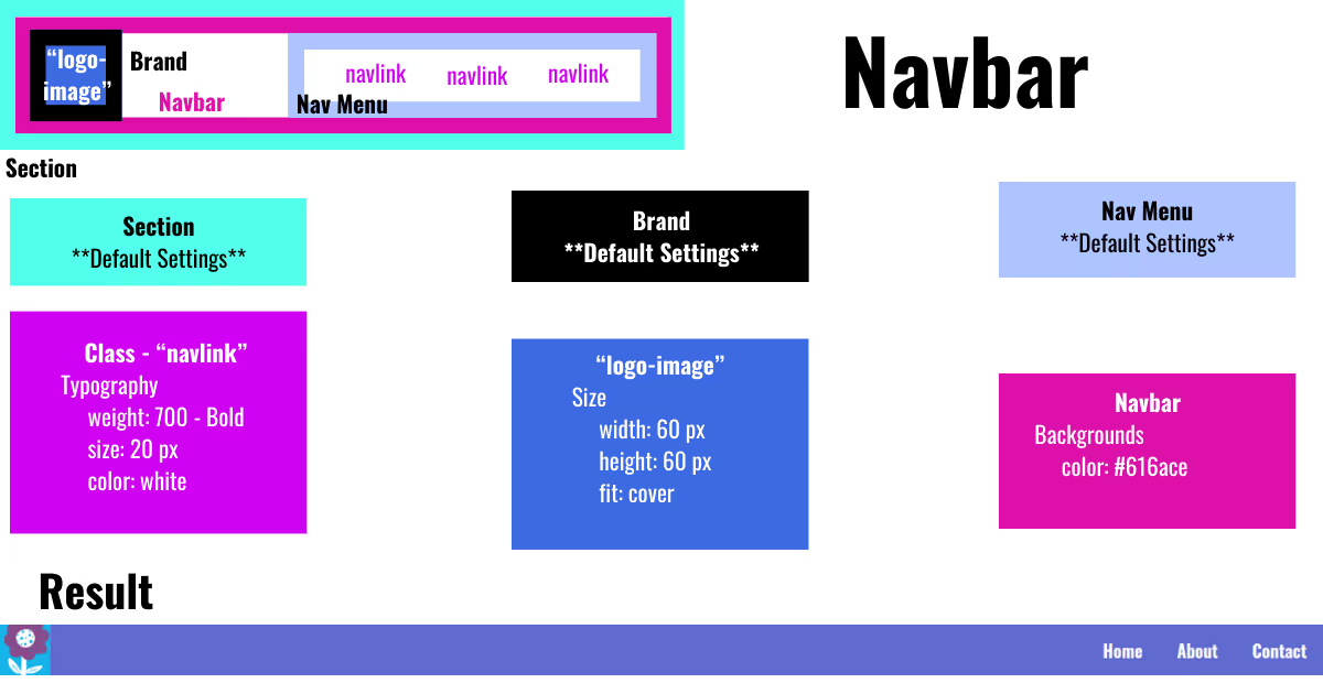
Building a Navigation Bar[27]
- Add a section - To add elements to a page, click on the add panel (signified with a plus sign) on the left menu. Add a section by clicking and dragging a section onto the page.
- Add navbar - Drag a “Navbar” into the section. If you can’t find “Navbar”, type "Ctrl/Command + E" and search "navbar". (Note: I want the navigation bar to expand across the entire page, so I skipped adding a container.)
- Change the link text inside of navbar- Clicking text in the navbar will allow you to change the content by typing.
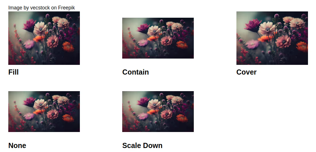
- Add a brand image - You can upload your brand logo in the “Assets” section (image icon left menu) and drag it into the brand section. I applied a class called “logo-link” because I plan to reuse the logo.You can adjust width and height manually under Styles > Size as well as “Fit”. You have five fit options:
- Fill - resizes your image (or video) so it fits within the width and height you said. This will often squish or stretch your stuff.
- Contain - keeps the ratio of your image but resizes it
- Cover - keeps the ratio of the image. Crops part of it if necessary.
- None - the image isn’t resized at all
- Scale Down - go to the smallest version of either None or Contain.
- Style your links - There are several links (navlinks) in your navbar. If you want to style them all in the same way, you can add a class (such as “navlink”) to all the links in the navbar. Any style applied to that class will be applied to all links with the “navlink” class [27].
- Style Navbar - Click on the navbar itself to change styles.
Building a Site Hero[26]
I want to use an image in my hero section.
To upload an image:
- Go to the assets section in the left-hand menu (image logo).
- Drag an image from a folder in your computer into assets.
To build a hero section:
- Add a section below navbar- Once again, use the "add" menu in the left hand menu.
- Drag a container into that section.
- Place an H1 heading in the container and change the text. You can also add a paragraph below that.
- Drag a text-link and place it below the heading. Click on link text to change the wording.
- Add a background image to the section - Click on your section and find background in the right style menu. Select your image.
- Click on the container - Under Layout, change display to flex and direction to vertical[26]. This will make all child elements of the container stack vertically[26].
.avif)
Building a CSS Grid of Logos[28]
Now we will make a grid of items. In the 101 tutorial, they use images of logos. However, any images work to show how CSS grid works. I picked flowers.
Add a section.
- Place a container in the section.
- Place a heading in the container.
- Place a div element after the heading inside of the container. Div is another type of container element to hold other elements.
- Now go to assets in the left menu (picture icon) and drag your images into div. You can upload images to assets by dragging images from your computer folder to the assets menu or by clicking on the folder icon. Add at least 4 images. I added 12.
- Click on div again and change the layout display to grid[28].